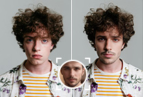
Make me one for a magazine or newspaper Composition is basically the art of orga
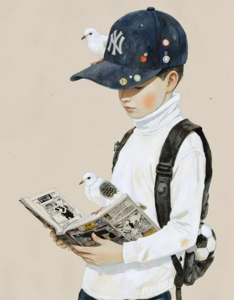
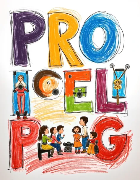
Make me one for a magazine or newspaper Composition is basically the art of organizing visual elements within a space so that the message is clearly understood, looks good and causes impact. It's like putting together a puzzle with purpose: Each piece (text, image, color, form, space, etc.) has to be placed with intention, not at random. The composition within a design is good for the following reasons: • Guide the viewer's eye to what's important. • Crea armonía y order visual. • Makes the design “breathe” (nothing to saturate it with unnecessary things). • Helps to make the message clear, direct and professional. Elements that are taken into account: • Visual hierarchy: What do you see first? And then what? • Balance: Can be symmetric ( order ado) or asymmetric (more dynamic). • Alignment: Nothing should be floating meaningless. Everything must have a reason to exist Where. • White space (o negative): No es space perdido; is the visual silence it gives Force the rest. • Contrast: So that the important thing stands out and doesn't mix everything. • Ratio: Suitable sizes according to their importance. • Unit: Everything should feel part of the same visual universe. Quick example: Think of a magazine cover. The title should be large and at the top (hierarchy), the images must be well aligned ( order ), and empty spaces help keep it from looking cluttered (space negativo). All this is composition In addition, you put a bar code
提示词
复制
Make me one for a magazine or newspaper Composition is basically the art of organizing visual elements within a space so that the message is clearly understood, looks good and causes impact. It's like putting together a puzzle with purpose: Each piece (text, image, color, form, space, etc.) has to be placed with intention, not at random. The composition within a design is good for the following reasons: • Guide the viewer's eye to what's important. • Crea armonía y order visual. • Makes the design “breathe” (nothing to saturate it with unnecessary things). • Helps to make the message clear, direct and professional. Elements that are taken into account: • Visual hierarchy: What do you see first? And then what? • Balance: Can be symmetric ( order ado) or asymmetric (more dynamic). • Alignment: Nothing should be floating meaningless. Everything must have a reason to exist Where. • White space (o negative): No es space perdido; is the visual silence it gives Force the rest. • Contrast: So that the important thing stands out and doesn't mix everything. • Ratio: Suitable sizes according to their importance. • Unit: Everything should feel part of the same visual universe. Quick example: Think of a magazine cover. The title should be large and at the top (hierarchy), the images must be well aligned ( order ), and empty spaces help keep it from looking cluttered (space negativo). All this is composition In addition, you put a bar code
信息
模型 & 风格

共 0 条评论
2
0